back
next

WIKI Rebranding (Concept)

This project was developed as part of a university class. It began with a briefing by the executives of WIKI – a kindergarten organisation with an annual turnover of well over 50 million euros. Following that, I conducted research on the industry and worked on developing a suitable brand strategy moving forward. Based on multiple studies and the insights from the briefing, I concluded that the company needed to shift the way it presents the jobs it offers. The main reason they approached us in the first place was to find a way to attract new applicants. It became clear that the profession had to be framed differently: everyone working in this field is contributing to shaping the future and building the very foundation of our society. To reflect this, the entire visual language had to be professional, modern, and adaptive – aligned with the spirit and responsibility of the profession.

WIKI Logo
SCG Logo Grid
Neulis Neue Wordmark
Font Analysis
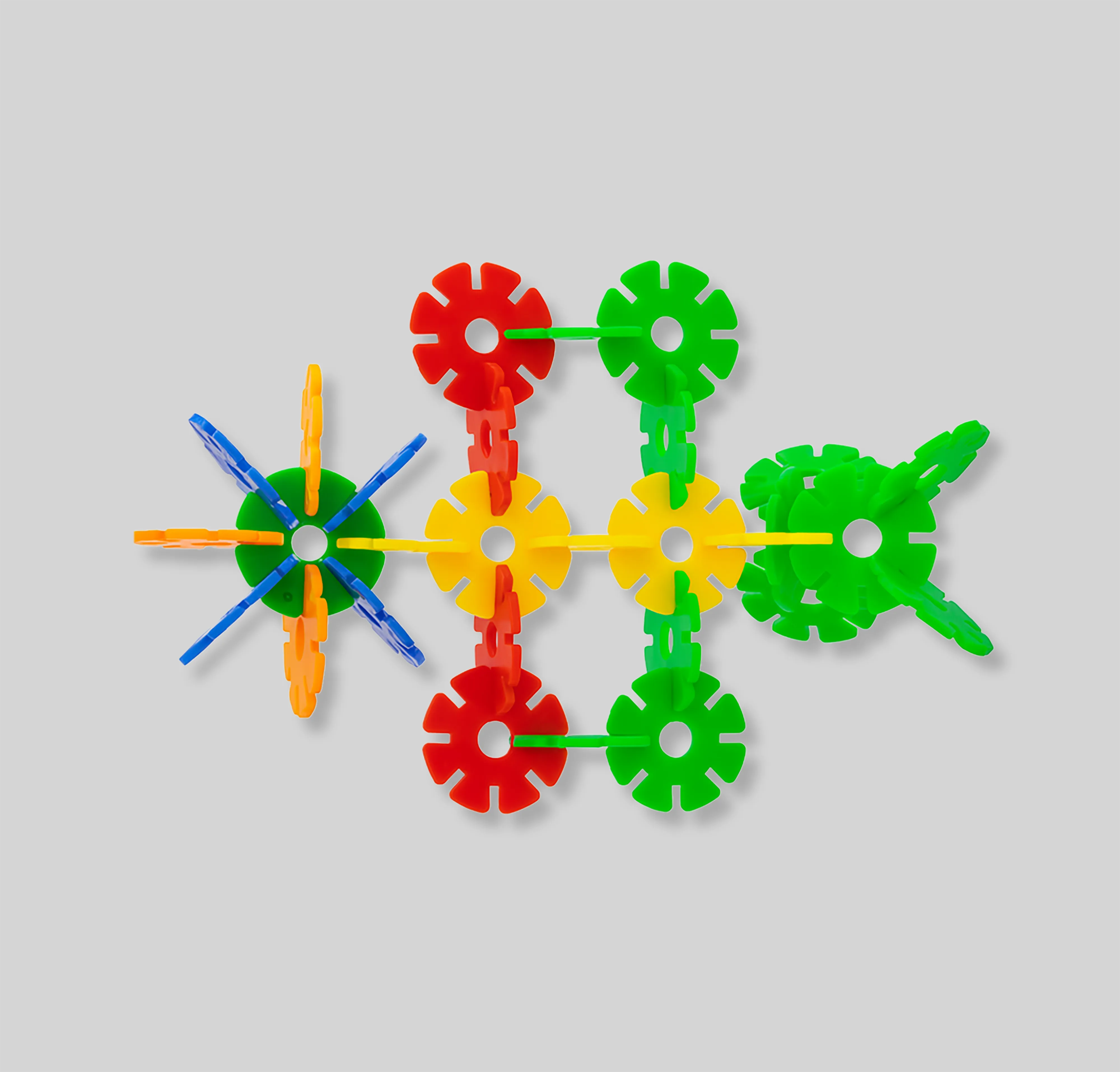
Construction Toy Image
Square Logo

The logo and visual language were inspired by the toys commonly found in kindergartens. The flexibility of the system reflects both the daily challenges and the adaptive nature of working with children. The logo can be applied in four different colors, creating a playful expression, but when used in a single color it conveys a more serious side, representing a multi-million-euro business. With the additional option of bringing the visual language to life through animations, the system is perfectly aligned with a modern world where motion plays an essential role across social networks.
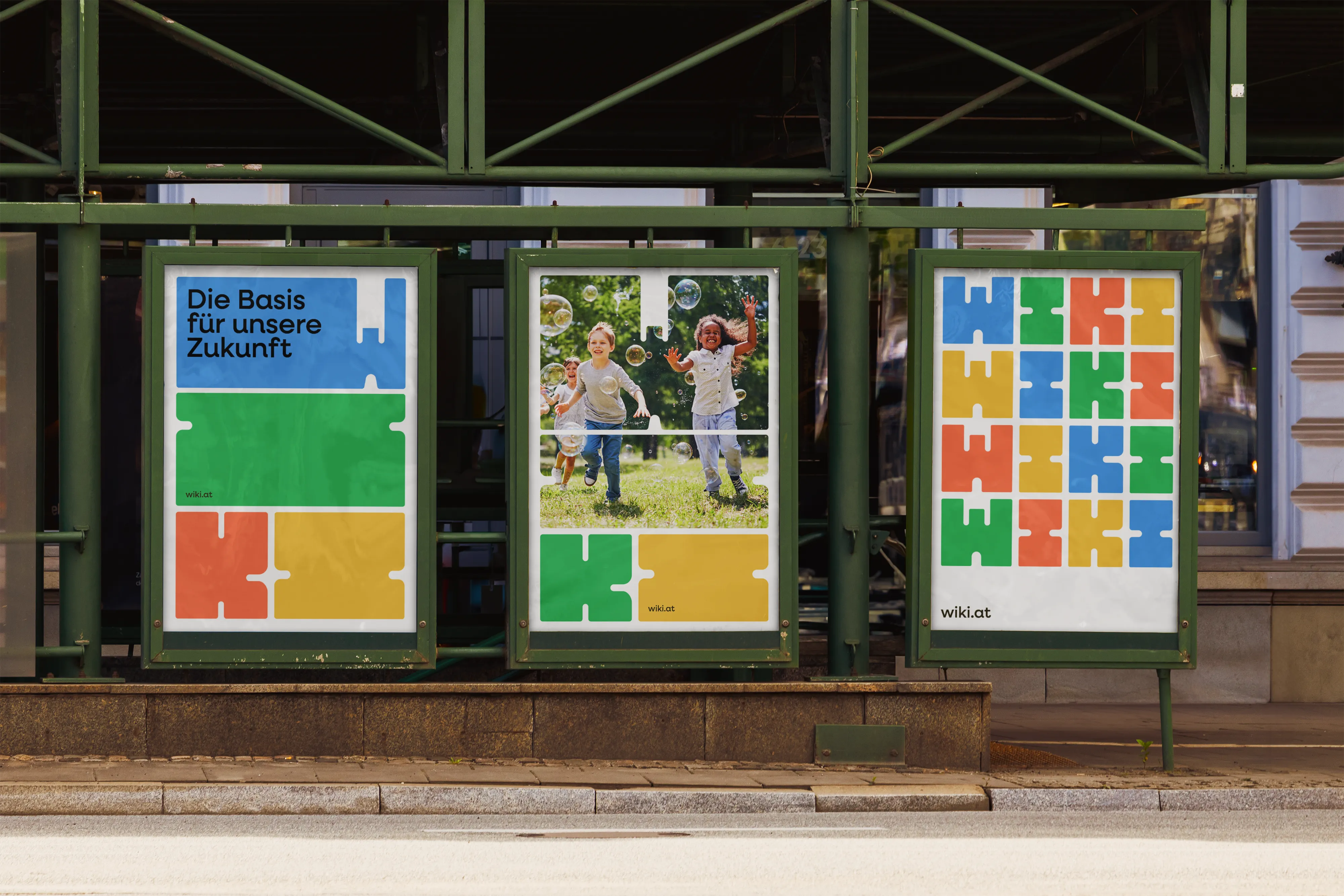
Poster Mockup
W Stretched
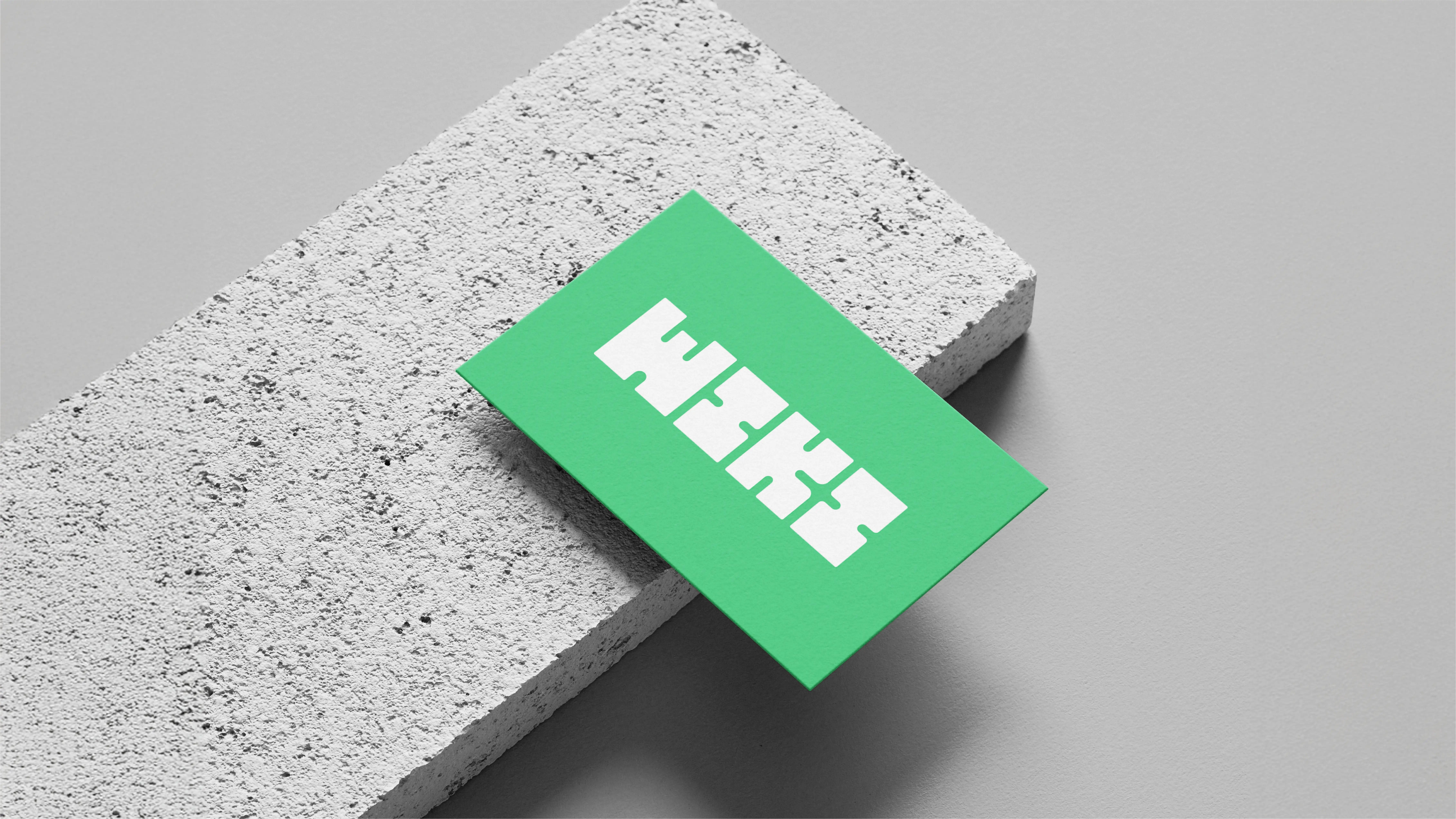
Business Cards
Cap
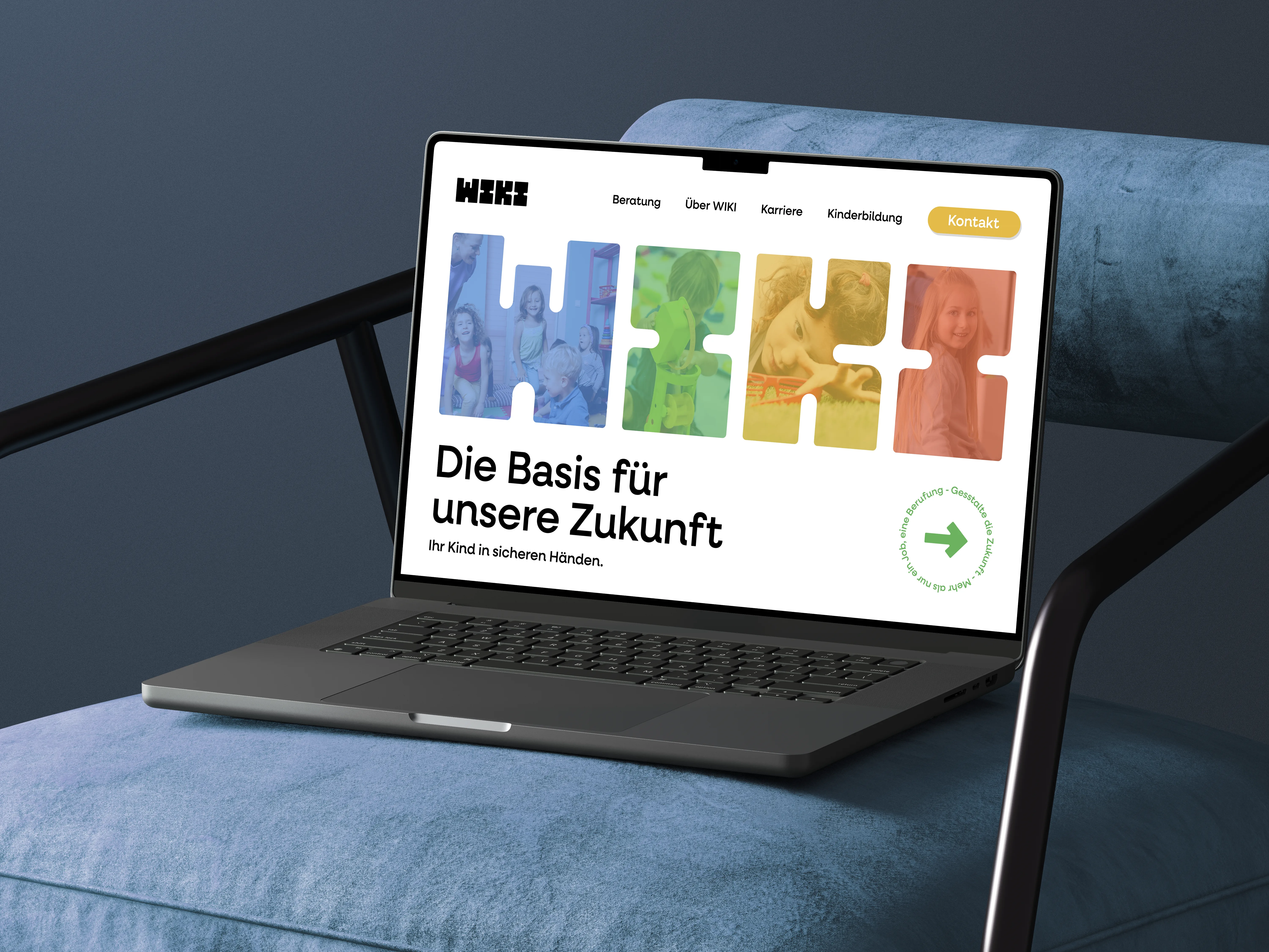
Desktop Mockup